Stop Wasting Ad Money: Why Ads Need a Landing Page, Not Your Home Page
Sending ad clicks to your home page often wastes budget. Learn why each offer needs its own focused landing page and what that page should contain.
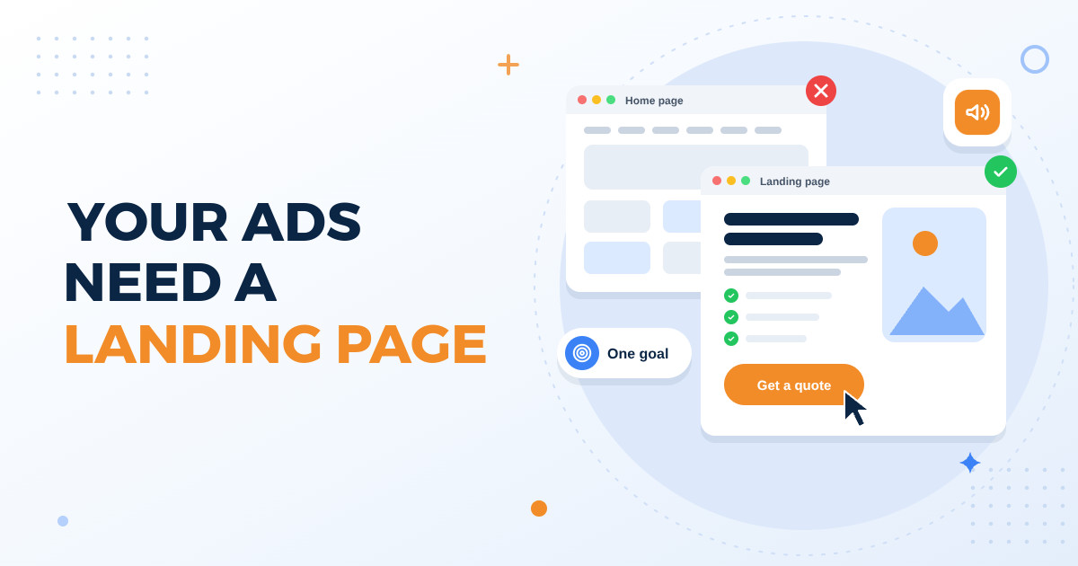
You run a Facebook or Google ad for your clinic's free dental check-up camp. People click. Then they land on your home page, which talks about your history, lists ten services, shows a photo gallery and links to a blog. The camp they clicked for is nowhere to be seen. Many visitors look around for a few seconds, feel lost and close the tab. You paid for every one of those clicks, and you got very few calls in return.
This is often why small business owners in Andhra Pradesh and Telangana feel that online ads do not work. The ad itself may be fine. The problem is where it sends people. This post explains why a dedicated landing page usually serves your ads better than your home page, what a good landing page contains, and how to check whether yours is doing its job.
What a landing page is, and how it differs from your home page
Your home page is like the front entrance of a big showroom. It has to welcome everyone: new visitors, old customers, job seekers, suppliers and people who only want your address. So it offers many paths and many choices. That is its job, and it should keep doing it.
A landing page is built for one group of people and one action. Someone who clicked an ad for 2BHK flats in a particular area should see those flats, their price range or how to ask for it, real photos, the location and a clear way to book a site visit. Nothing else. Think of it as a salesperson who meets the customer at the gate and talks only about what they came for.
Why sending ad traffic to your home page wastes budget
When the page does not match the ad, the visitor has to work to find what they wanted. Many people will not bother. Every extra click, menu or scroll is another chance for them to leave and go back to their WhatsApp chats.
- Message mismatch: the ad said admissions are open for a class, but the page talks about the school's founding story. The parent wonders if they are even on the right site.
- Too many choices: menus, sliders, service boxes and social media links all pull attention away from the one thing you want the visitor to do.
- No clear next step: the phone number is hidden in the footer and the enquiry form is two or three pages deep.
- Messy measurement: when ad visitors and regular visitors land on the same page, it becomes hard to tell which enquiries came from which ad.
- Slow loading: home pages are often heavy with videos and large images, and many visitors on mobile data simply will not wait.
What a good landing page contains
A good landing page does not need to be long or fancy. It needs to answer the visitor's questions in the order they think of them, and then make it very easy to act. Here is what to include.
- A headline that matches the ad: if the ad says weekend family lunch buffet in Kakinada, the page headline should use almost the same words, so the visitor knows instantly they are in the right place.
- Clear details of the offer: what exactly they get, who it is for, where, when and any conditions. If you prefer not to show the price, tell them how to get it quickly.
- Proof you can be trusted: genuine customer reviews, photos of your actual shop, clinic or project site, and only those registrations or certifications you really hold.
- One main action: call now, chat on WhatsApp, book a visit or fill a short form. Repeat the same button near the top, middle and bottom of the page.
- A short form: ask only what you truly need, usually name, phone number and perhaps one question. Every extra field gives people a reason to stop.
- Answers to common doubts: a few short questions and answers about parking, timings, payment options, home visits or cancellations.
Build it for the phone first
Many people who click local business ads do so on a phone, often on patchy mobile data. Do not guess the exact mix for your business; your ad account reports show how many clicks came from mobile and how many from computers. Then design the page for a small screen first and treat the desktop version as the extra.
- Compress images and avoid heavy autoplay videos at the top of the page.
- Make the call and WhatsApp buttons large enough to tap easily with a thumb.
- Show the key offer and the main button on the first screen, before any scrolling.
- Use readable text and a simple single-column layout instead of tiny fonts and crowded boxes.
- Open the page yourself on an ordinary phone using mobile data, and note how long it takes to appear.
One page for each offer or audience
You do not need a separate landing page for every single ad, but you should have one for every different offer or audience. A restaurant running ads for catering orders and for weekday lunch deals is talking to two different kinds of customers. A real estate firm selling both plots and villas, or a coaching centre promoting two different courses, should give each its own page.
Language matters too. If your ad is in Telugu, the landing page should also be in Telugu. Switching to English after the click breaks the comfort and trust the ad just created.
How to know if your landing page is working
You do not need complicated tools to begin. Start with your conversion rate: the number of enquiries divided by the number of visitors who came from the ad. To show the arithmetic: if 200 people visited and 8 of them called or filled the form, that is 4 out of every 100 visitors. There is no universal good number; your own figure is the baseline to beat. Track it for a couple of weeks, then change one thing and compare.
Next, work out your cost per enquiry: total ad spend in rupees divided by the number of enquiries. Check your own records for roughly how many enquiries turn into paying customers, and compare the resulting cost per customer with what an average customer is worth to you over time. If one patient, admission or flat booking brings in far more than it costs you, the page is pulling its weight. If not, improve the page before you increase the budget.
- Avoid changing many things at once, or you will never know what actually helped.
- Do not judge the page after only one or two days of ads.
- Reply to calls and WhatsApp messages quickly, because even a great page cannot fix slow follow-up.
- Remove or update an offer as soon as it ends, so visitors are not disappointed.
Your home page tells your whole story, while a landing page finishes one specific conversation. When you are paying for every click, sending people to a page built exactly for what they clicked on is one of the most practical ways to make the same ad budget work harder. Start with your best-selling offer, build one focused page, measure it honestly and improve it step by step.
If you would like help planning or building landing pages for your ads, the Knight21 team in Kakinada would be glad to talk through your current ads and pages with you. You can reach us at knight21.in/contact whenever you are ready. Your success is our mission.